2024
Training Resource Hub
Making a complex training ecosystem easier to navigate.

ACCA offers professional training across multiple formats, including in-person, live virtual, and on-demand learning. The challenge wasn't a lack of valuable content. It was helping members understand what was available and quickly find the training that fit their needs.
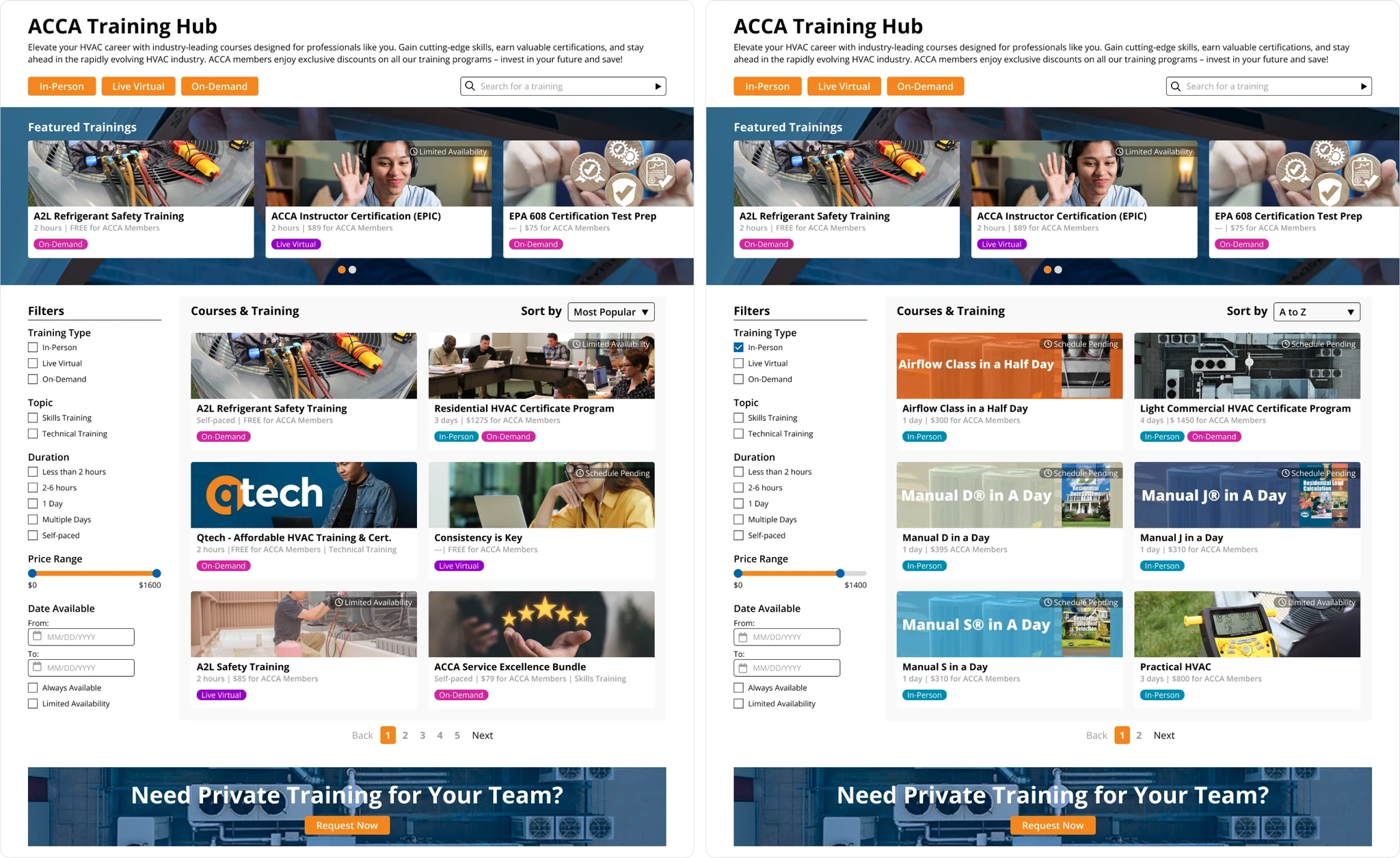
As part of AIMG, I redesigned the experience around a centralized Training Resource Hub, creating a clearer content structure, filtering system, and comparison experience within a rapid design sprint.
THE CHALLENGE
The content existed. The discovery experience didn't.
ACCA's training resources were distributed across multiple areas of the website, requiring members to move between pages to understand the different courses, formats, and opportunities available.
The problem wasn't simply navigation. Users lacked a single place where they could explore the full training ecosystem, narrow their options, and compare relevant programs without piecing the information together themselves.

UNDERSTANDING THE ECOSYSTEM
Before reorganizing the interface, I needed to understand the content.
I started by auditing ACCA's existing training offerings and mapping how different programs, formats, and information were distributed throughout the site.
I also looked at how comparable professional organizations organized large educational catalogs, focusing on patterns around navigation, filtering, and content grouping.
This helped shift the problem from simply redesigning several pages to defining a clearer system for how ACCA's training content should be discovered.
THE CORE DECISION
Bring everything together without making everything feel the same.
Centralizing the training catalog solved one problem, but simply putting every offering onto one page could easily create a new one: information overload.
My approach was to create a shared structure that could accommodate different training formats while preserving the information users needed to understand each option.
In-person, virtual, and on-demand training could now live within the same experience without forcing users to navigate separate sections of the website first.
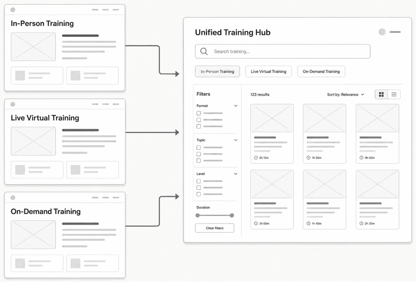
CONTENT DISCOVERY
Filtering and tagging needed to do different jobs.
Once the content was centralized, the next challenge was helping members narrow it down.
I introduced a filtering system to support active discovery, allowing users to reduce the catalog based on what was relevant to them. Alongside that, a tagging system communicates important attributes directly within the interface.
The distinction was intentional: filters help users search, while tags help users understand.
Together, they create a faster path from a large training catalog to a smaller set of meaningful options.

DESIGNING FOR COMPARISON
Members shouldn't have to open every course to understand their options.
The training cards became an important part of the experience because they needed to support decision-making before a user clicked into a course.
I prioritized the information members would need to scan and compare quickly, including training format, duration, pricing, and time-sensitive status information.
Instead of treating each card as a promotional tile, I approached it as a compact decision-making tool.

NAVIGATION
Give users multiple paths without creating more complexity.
Not every member approaches training discovery the same way.
Some arrive knowing the type of training they want, while others need to browse more broadly. I introduced secondary navigation alongside the filtering experience so users could move between major training categories quickly while still having access to the complete hub.
The goal was to provide more control without recreating the fragmented experience we were trying to remove.
WORKING WITH THE EXISTING SYSTEM
The new experience needed to feel like ACCA, not a separate product.
Rather than creating a new visual language for the hub, I worked within ACCA's existing brand and design foundation while introducing the components the new experience required.
I extended the system with reusable patterns for training cards, tags, navigation, filters, typography, iconography, and supporting interface states.
This kept the new hub visually connected to the larger ACCA experience while creating patterns that could support additional training content over time.
REFLECTION
Sometimes the biggest UX improvement is better structure.
This project reinforced how much interface complexity can originate from the way content is organized underneath it.
The solution wasn't to add more navigation or more information. It was to create a clearer relationship between the content ACCA already had and the way members needed to explore it.
Working within a short timeline also pushed me to focus on the decisions with the greatest impact: understanding the content model, defining the discovery logic, and designing reusable patterns around it.