2026
Event Registration Experience
Improving a complex registration flow within the constraints of an existing third-party platform.

A professional membership organization needed to improve the event registration experience within its existing commerce and CRM platform.
The underlying functionality had to remain intact, but the interface lacked clear visual hierarchy and consistency with the organization’s broader digital experience.
I redesigned key moments across the registration journey, focusing on clarity, hierarchy, terminology, and reusable UI standards that could be implemented without disrupting the system underneath.
THE CONSTRAINT
Improve the experience without rebuilding the product.
The registration experience was powered by an existing third-party platform connected to the organization’s store and CRM.
That created an important constraint: the underlying functionality and registration flow could not change.
Instead of approaching the project as a full redesign, I focused on identifying where hierarchy, language, and visual design were making the existing experience harder to understand.
The goal was to create meaningful improvements while working within the technical boundaries of the platform.
THE AUDIT
The flow worked, but the interface didn’t always make the next step clear.
I walked through the entire registration journey from a logged-out state through registrant selection, session selection, additional questions, registration review, and the transition into the cart.
Several recurring issues surfaced.
Primary actions lacked visual prominence, secondary calls to action competed for attention, information was repeated unnecessarily, and inconsistent styling made portions of the registration experience feel disconnected from the organization’s broader brand.
Rather than changing the sequence itself, I focused on making each step easier to scan, understand, and complete.

VISUAL HIERARCHY
The primary action should feel primary.
One of the most consistent issues throughout the experience was that important actions didn’t always look actionable, while secondary information could carry too much visual weight.
I strengthened primary buttons through clearer shape, contrast, weight, and spacing while reducing the prominence of supporting actions that still needed to remain visible.
The goal was simple: users should be able to quickly understand what they need to do next.
REDUCING REDUNDANCY
More information isn’t always more clarity.
After login, the selected registrant’s information occupied a significant amount of space even though the user’s identity was already visible elsewhere in the interface.
I reduced that repetition so the page could prioritize the registration task itself.
It was a small adjustment, but it reflected a principle I applied throughout the project: when functionality is fixed, removing unnecessary visual competition can make the existing experience significantly easier to understand.

WORKING ACROSS THE FLOW
Consistency mattered more than redesigning individual screens.
The registration journey spans multiple steps, including selecting a participant, choosing sessions, answering additional questions, reviewing selections, and adding the registration to the cart.
Instead of treating each screen as an isolated redesign, I created a consistent hierarchy that could carry across the entire experience.
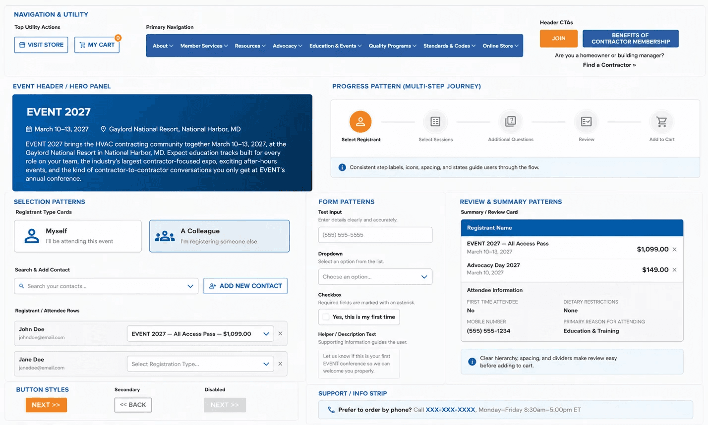
Buttons, headings, progress indicators, spacing, forms, messaging, and supporting actions were treated as parts of one system so users wouldn’t need to relearn the interface from step to step.
BRAND ALIGNMENT
A third-party experience should still feel like part of the product.
The existing platform introduced interface patterns and colors that didn’t consistently align with the organization’s broader visual identity.
Rather than correcting individual screens one at a time, I created a focused UI guide covering colors, typography sizing, button treatments, and reusable interface patterns.
This gave the implementation team a shared visual reference that could extend beyond the screens included in the initial redesign.
DESIGNING FOR IMPLEMENTATION
The solution had to work within someone else’s system.
Because the changes would ultimately be implemented by an external platform team, I designed around the capabilities of the existing interface rather than proposing an idealized experience that couldn’t realistically be built.
Each recommendation was grounded in the current system and focused on changes that could improve usability while preserving the workflows and integrations already in place.
That constraint shaped both the design and the deliverables. The work needed to be visually clear enough for stakeholders to evaluate and specific enough for an external implementation team to follow.

REFLECTION
Constraints can sharpen the design problem.
This project reinforced that improving an experience doesn’t always require changing its architecture or adding new functionality.
With the registration logic already established, the design problem became more focused: identify the moments where hierarchy, language, and inconsistency were creating unnecessary friction and make those moments clearer.
Working within those boundaries pushed me to be deliberate about every recommendation and prioritize improvements that could realistically make it into the product.


