Case Study
5 min read

What are we solving?
PROJECT OVERVIEW
Background
Waiting for your favorite Starbucks drink shouldn’t be a guessing game. Many customers, including myself, have experienced the frustration of placing a mobile order expecting a quick pickup, only to be met with uncertainty and long waits upon arrival. This project, part of my capstone, aimed to address this issue by enhancing the Starbucks experience through a queue feature that provides real-time wait time updates.
Problem
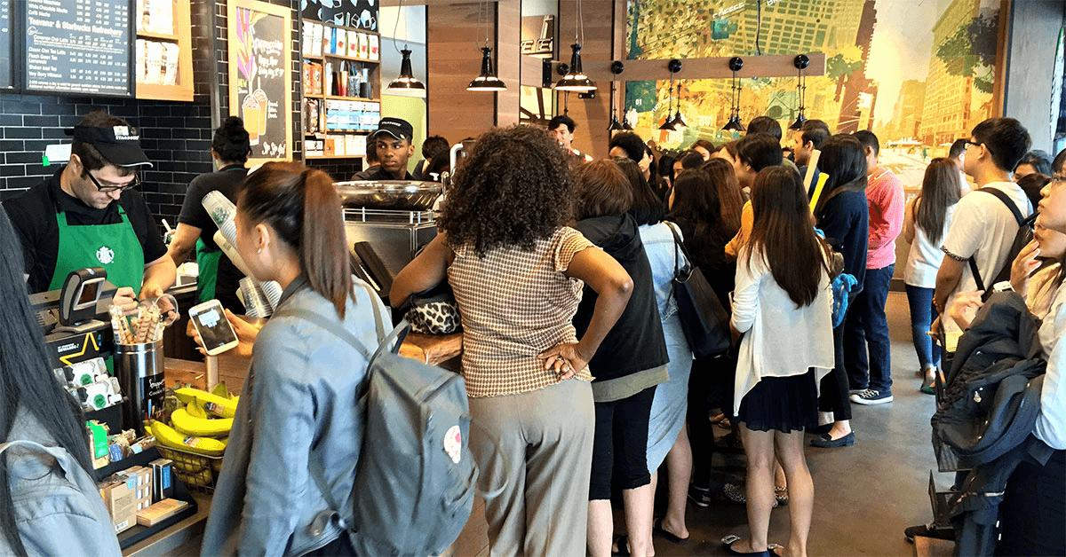
Even with the convenience of placing mobile orders, Starbucks customers often face unpredictable wait times. Without clear visibility into the status of their orders, users are left wondering when their drinks will be ready. This lack of transparency leads to frustration and, in some cases, customers abandoning their orders.
Impact
Enhanced customer satisfaction through real-time transparency.
• Implemented a queue feature that displays estimated wait times, allowing customers to make informed decisions about when to pick up their orders.
• The feature improves the overall Starbucks experience by reducing frustration and uncertainty for both mobile app users and guests ordering as non-app users.
Goals
Empower customers with visibility into their order status.
• Introduce a queue feature that provides real-time wait time estimates.
• Ensure both app and non-app users can access the feature seamlessly.
• Minimize uncertainty by giving users clear, actionable information about their order progress.

Picture This
You're at Starbucks, craving your favorite pick-me-up, only to be faced with an overwhelming line. Ever placed a mobile order, thinking your drink is ready, but end up waiting with the other pickups in uncertainty?
The goal is to design a queue feature that integrates seamlessly into the Starbucks app, improving customer satisfaction by enhancing order visibility and control.
01 Introduction
Reducing wait-time uncertainty for Starbucks customers.
02 Research & Synthesis
Identifying opportunities.
Understanding Wait-Time Frustrations
To validate the need for a queue feature, I set out to uncover the frustrations customers face with long lines at Starbucks. My research aimed to answer:
• How do users feel about waiting in line?
• Would knowing wait times beforehand change their behavior?
• How would a queue feature improve their overall experience?
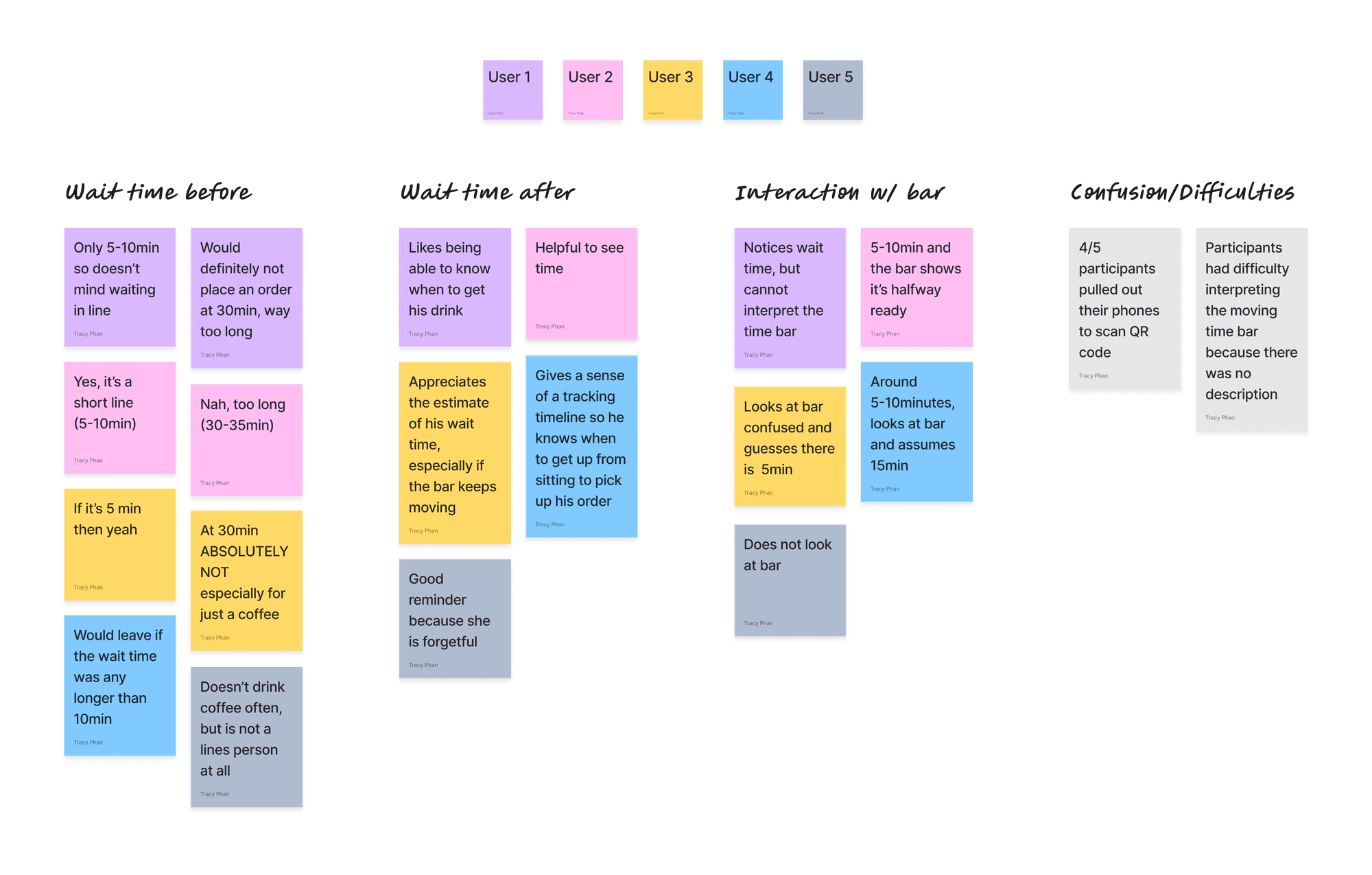
Methodology: Mixed-Methods Approach
Key Survey Insights
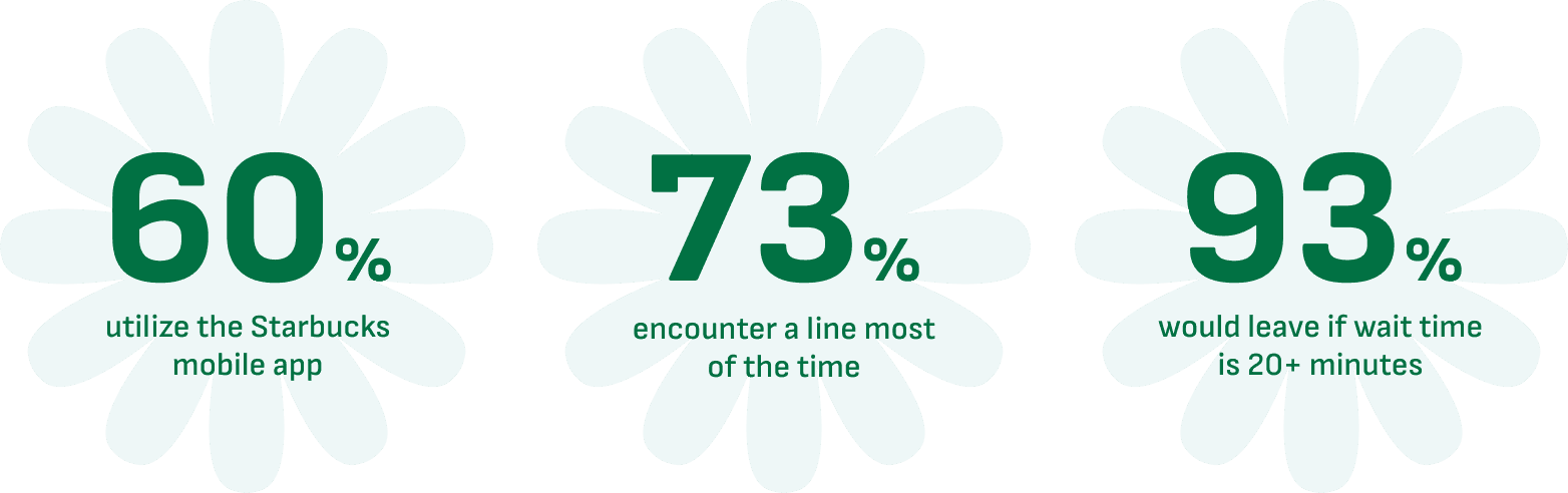
Survey data from ~15 participants provided critical insights:
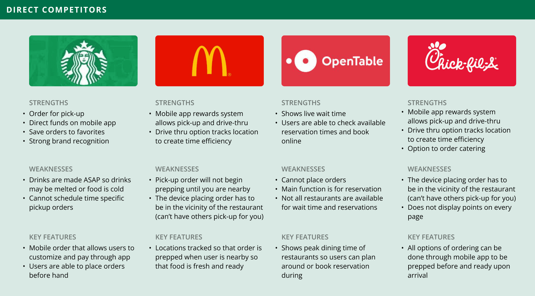
Competitor Analysis: Learning from Existing Platforms
I analyzed platforms such as Chick-fil-A, Dunkin’, and McDonald’s to assess how competitors manage wait time transparency and queue features. This analysis highlighted gaps in Starbucks' current system, where most competitors provide more accurate time estimates or order progression indicators.
03 Defining the user
Understanding and empathizing with the user.
Who are the customers?
I crafted user personas representing diverse Starbucks customer profiles, tailoring each persona to capture the unique needs and preferences of various types of users. In addition, each persona resembles a Starbucks card!


Customer journey
Task flow
The task flow involves users scanning the QR code to access the new feature. Through a series of steps, pages, and decisions, they can place an order and track their drink's completion process.


04 Design Process
Crafting an intuitive queue feature.
Coming Up with Designs
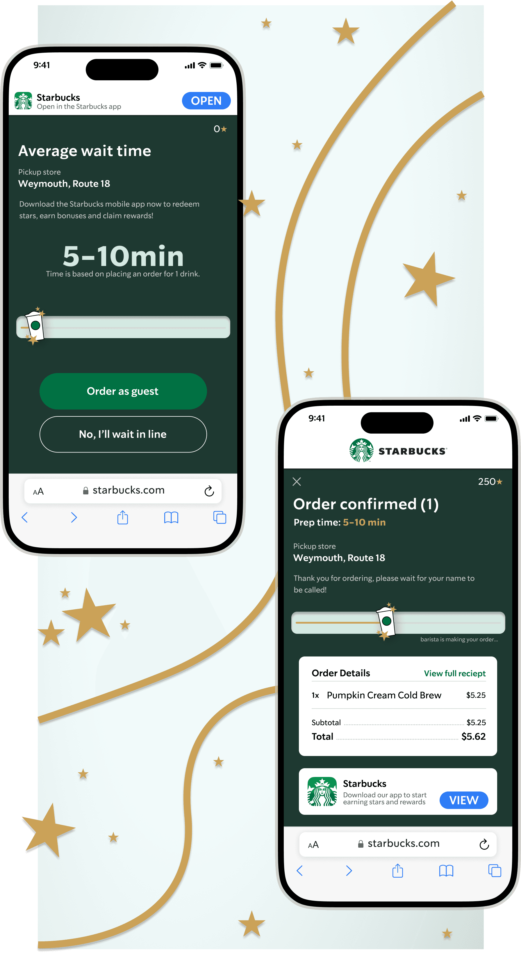
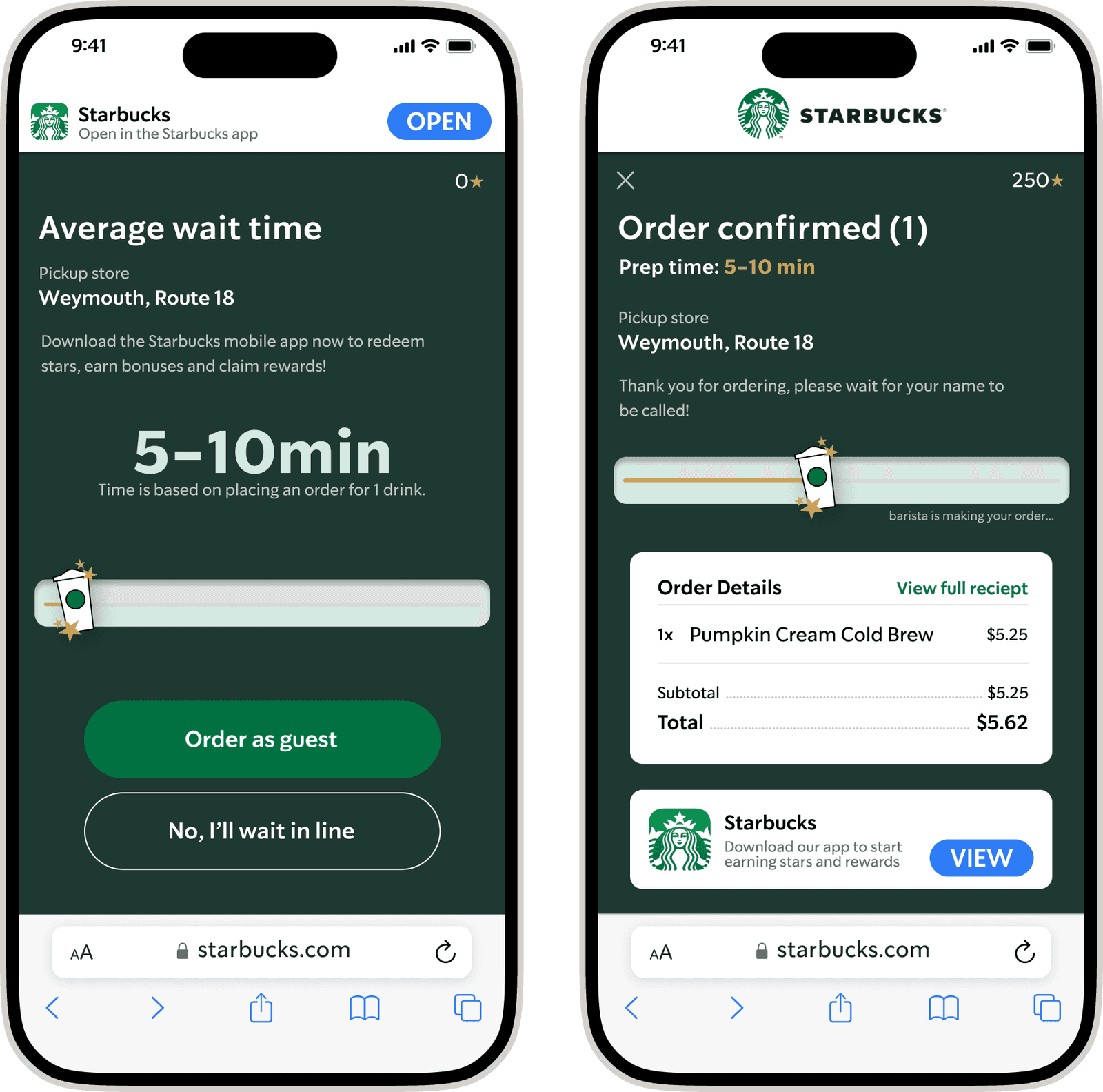
In the wireframing process, my emphasis was on the key pages both pre and post-ordering. These screens showcasing the queue feature, providing users with an estimated wait time. Notably, the app ordering system has been extended to the website, enabling users without the app to place orders as guests for a seamless experience.
Let’s Hear What the Customers Think
Once designs were complete, I conducted usability tests on the queue prototype.
Goal
Analyze how users interact with a wait time feature in Starbucks to determine whether this feature solves their frustration of uncertain wait times by observing their experience, while navigating the prototype.
Task Flows
Scan QR code to check wait time
Order as guest or in mobile app
Order a grande pumpkin cream cold brew
Check out and check wait time
Success Metrics
• Users know to scan QR code and are able to check their wait time without difficulty
• Users are able to complete tasks without confusion.
• Users are able to appropriately estimate their wait time before and after placing an order
Usability Test Results
All participants unanimously rated the usability as a perfect 5 on a scale from 1 to 5, indicating the feature's simplicity and ease of use. The feedback indicated that participants found the feature to be highly beneficial, particularly in aiding their decision-making process when considering placing an order at Starbucks.

Final Solution & Impact
A transparent, real-time queue experience.
Final Designs & Prototype
Post-usability test, feedback revealed that participants would find it more beneficial to have visibility into the steps of their order process. Researching other competitors, it became evident that providing users with the status of their order contributes to a more positive experience in tracking their items. This insight highlights an opportunity to enhance the feature by incorporating a clear and informative order tracking system.
Takeaways
Introducing a feature for users to check wait times before ordering coffee can significantly boost customer satisfaction at Starbucks. Long lines often create uncertainty and frustration, sometimes prompting customers to leave. After ordering, the addition of a drink status feature keeps users informed about their order's progress, providing peace of mind during longer waits.
This project, aimed at addressing a common pain point, was not only fulfilling for me but also resonated with other users facing similar challenges. It was especially enjoyable as my first experience with adding a feature, presenting unique challenges while working on a personal project within an already established company.
Let's Connect
Get in touch, or just say hello!